
 English
 Deutsch
 Čeština
 Slovenčina
 Français
 Italiano
 Español
 Nederlands
 Polski
Modular Exhibition Stand Graphics That Work When Reconfigured: A Design Guide
Discover how to design graphics for modular exhibition stands that maintain visual impact, narrative logic, and legibility across any booth layout.
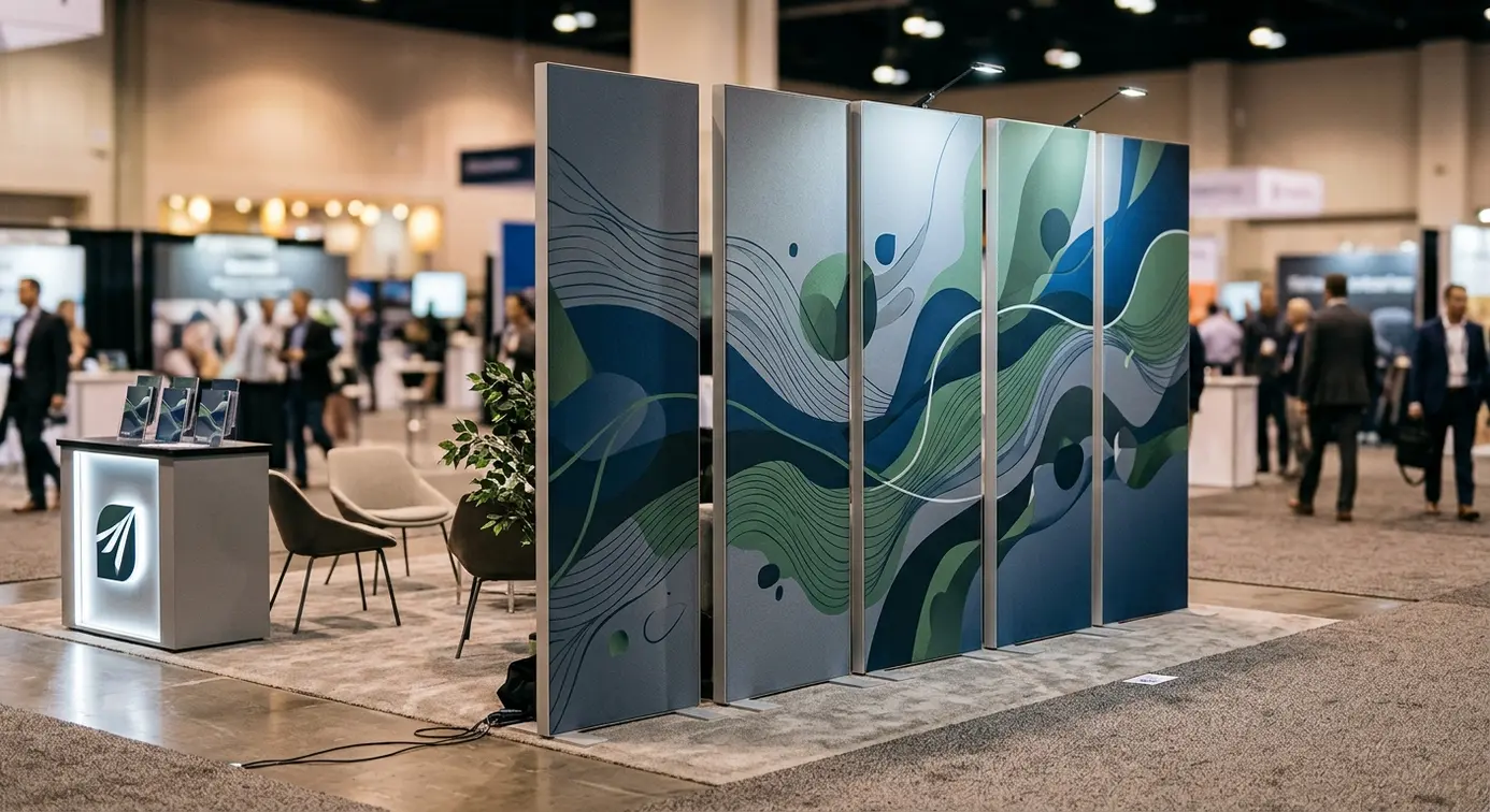
Investing in modular exhibition display systems is a strategic move for many businesses seeking to optimise their trade show budgets. However, the real test of their versatility arrives when adapting the display to a completely new booth footprint. Creating graphics that preserve aesthetic consistency, narrative logic, and crystal-clear messaging—whether in a straight inline configuration, an L-shaped corner, or broken down into standalone island displays—requires a fundamentally different mindset from designing conventional, single-piece backdrops. In this article, we explore modular design methodology, content hierarchy principles, and practical layout techniques that guarantee maximum brand flexibility without the recurring cost of reprints.
Table of contents:
- The challenge of flexibility: why traditional composition fails on modular stands
- Panoramic graphics vs independent content modules
- Information architecture resilient to stand reconfiguration
- Strategic placement of key visual communication elements
- Where to position logos so they always work for your brand
- Presenting your product offering on individual panels
- Contact details and calls to action across modular spaces
- Case study: one graphic set across three different stand layouts
- Straight-line inline layout
- L-shaped corner layout
- Split layout with autonomous zones
- Common composition mistakes in modular stand design
- Frequently asked questions (FAQ)
The challenge of flexibility: why traditional composition fails on modular stands
The traditional approach to exhibition graphic design assumes that the advertising medium is a self-contained canvas with fixed proportions. The designer builds a single, integrated layout around a central focal point, a large headline spanning the entire width, and supporting brand details toward the edges. While this works seamlessly for bespoke, single-use builds, it creates severe branding headaches in dynamic exhibition programmes.
By opting for modular display walls, an exhibitor gains the freedom to reshape stand geometry depending on booked floor space, venue regulations, or specific event objectives. From a designer's perspective, this means the physical backdrop is no longer a monolithic surface, but an assembly of interconnected planes. A traditional panoramic design collapses the moment two central sections must be dropped from a five-panel run, or when a straight wall is pivoted into a right angle. Severed taglines, awkwardly cropped people across key features, and abruptly broken visual motifs are the inevitable result of non-modular thinking.
Designing for spatial flexibility means anticipating how individual frames interact. A modular exhibition graphic design must treat every frame as capable of fulfilling three distinct roles: functioning as a standalone display, serving as an integral link in a continuous narrative, or acting as a supportive backdrop for other display furniture.
Panoramic graphics vs independent content modules
Designers typically face a key dilemma: whether to deliver a dramatic, wide-format panoramic visual spanning the entire length of the stand, or to create a series of independent informational panels. While a large-scale panorama delivers impressive scale and commands attention from a distance, it offers virtually zero flexibility. Removing even one segment disrupts the framing and irreparably damages the stand's visual balance.
The alternative is an autonomous modular approach, where each panel forms a self-contained visual and editorial unit. While this guarantees complete interchangeability and effortless reordering, it runs the risk of visual fragmentation, resembling an accidental collage of unrelated posters. The optimal, professional solution is a hybrid visual architecture: a cohesive, low-contrast textured background paired with strictly defined, self-contained content zones.
| Composition attribute | Panoramic approach | Independent content modules | Hybrid modular design |
|---|---|---|---|
| Flexibility when rearranging panels | Very low (requires a fixed sequence) | Very high (any order works) | High (defined permutation rules) |
| Scalability (adding/removing walls) | Requires printing entirely new graphics | Complete (each panel works on its own) | Complete within the established layout grid |
| Visual cohesion from a distance | Very high (monolithic effect) | Moderate to low (fragmented look) | Very high (fluid background, clean sections) |
| Reading hierarchy | Horizontal (left to right) | Vertical (independent per panel) | Balanced (hero panel plus supporting panels) |
Information architecture resilient to stand reconfiguration
High-performing graphics for modular display systems demand the principles of modular information architecture. In practice, this means moving away from linear storytelling toward faceted communication. Instead of constructing an extensive narrative that requires visitors to read three adjacent walls in sequence, you present a suite of complementary messages arranged around one core proposition.
Each segment should address a specific visitor question and function without leaning on neighbouring panels. If one panel highlights your flagship product, another outlines implementation benefits, and a third presents market proof points, rearranging the booth layout will never compromise the underlying logic. Exhibition attendees do not read booth walls like books; they scan the hall, pausing only at elements that immediately align with their immediate priorities.
Strategic placement of key visual communication elements
Designing multi-format display panels requires disciplined adherence to ergonomic viewing zones. Regardless of how the frames are combined, the physics of human perception and exhibition hall traffic stay the same. The lower zone (from the floor up to roughly 80 cm) is constantly obscured by counters, literature racks, tables, and passing visitors. Conversely, the upper zone (above 180 cm) remains clearly visible across the hall over the heads of the crowd.
A well-designed modular panel treats installation height as a permanent hierarchy guide: elements meant to build broad brand awareness belong at the very top, while detailed technical messaging belongs in the central zone, directly at eye level for a standing visitor.
When planning a reconfigurable exhibition stand with modular fabric walls, you must implement a universal layout grid across every frame in the set. Only then will individual modules align to form a clean, cohesive typographic horizon—whether positioned side by side along a straight wall or bent into an L-shaped or U-shaped layout.
Where to position logos so they always work for your brand
A common pitfall is placing the primary brand logo exclusively on one central panel. Whenever a smaller venue forces the team to omit that specific section, the stand loses its primary brand anchor. However, simply stamping a massive logo onto every single wall creates visual clutter and aesthetic fatigue.
Professional modular design resolves this with a dominant brand mark combined with micro-branding. One or two focal panels feature the full corporate logo alongside the main positioning tagline across the top viewing tier. The remaining panels carry a subtler, recurring brand icon or compact mark anchored in a consistent position (such as the top-right corner, respecting uniform margins). As a result, whichever combination of walls travels to a regional conference, your brand identity remains intact, prominent, and unmistakable.
Presenting your product offering on individual panels
Presenting products or services on modular stands should adhere to the principle of one core message per panel. Rather than spreading intricate technical diagrams across three adjoining frames, it is far safer to contain each topical unit within the boundaries of a single fabric panel.
Apply a consistent structural template across product-focused panels:
- A strong, concise headline defining the problem or solution category at the top of the active reading zone.
- A central product visual, render, or clean infographic serving as the primary optical anchor.
- Up to three key benefit points, written concisely and reinforced by minimalist icons.
- Generous safety margins from both vertical edges, avoiding visual crowding near the physical frame joins.
This disciplined structure ensures that even if you take only two out of four panels to an industry expo, your stand still looks polished and intentional—never like an incomplete setup thrown together at the last minute.
Contact details and calls to action across modular spaces
Placing web addresses, QR codes, and direct calls to action (CTAs) within flexible display systems demands strict discipline. Running a continuous footer strip with contact details along the bottom across all panels is a critical error—it guarantees the text will be broken whenever the order or layout changes.
Contact details and interactive elements should be designed as compact, self-contained units or consolidated on a dedicated reception module. QR codes leading to digital brochures or booking forms should sit between 120 and 140 cm from the ground, ensuring effortless smartphone scanning without bending down. If your booth includes a dedicated reception or welcome counter wall, that panel should carry the full suite of contact details, freeing up informational walls from secondary clutter.
Case study: one graphic set across three different stand layouts
To demonstrate how this theory translates into practice, consider a standard four-panel setup created for a modern technology firm. The kit comprises: Panel A (Brand & Core Value Proposition), Panel B (Flagship Product), Panel C (Industry Applications), and Panel D (Proof Points / Case Studies & Contact Details). The backdrop across all panels features a unified modular gradient with a subtle vector grid whose lines align seamlessly at the seams, regardless of panel order.
By investing in modern modular fabric display walls, the company gains a versatile kit capable of addressing vastly different exhibition scenarios using a single production run of textile graphics.
Straight-line inline layout
In a standard inline sequence (A + B + C + D) spanning several metres of booth frontage, the panels unite into a continuous backwall with the grandeur of a traditional panorama. An attendee walking down the aisle experiences a logical progression: from strong brand impact on the left (Panel A), through the core offer (B and C), to commercial closing points with a clear CTA (D).
Because headlines follow an identical horizontal baseline and the background transitions smoothly, the entire stand reads as one integrated, expansive design. At the same time, because no lettering or key visual elements straddle panel seams, the aluminium frame joints blend into the design grid naturally rather than appearing as awkward assembly flaws.
L-shaped corner layout
At the next event, the organiser assigns an open corner plot with two open sides. The configuration adapts into a right-angled L-shape: the rear wall comprises panels A and B, while the return wall at 90 degrees features panels C and D.
In a conventional panoramic setup, wrapping the artwork around a corner would distort the imagery and compromise legibility. With a modular approach, the corner acts as an intuitive zone separator. The back wall (A+B) serves as the primary brand welcome zone, while the side wall (C+D) establishes a more focused environment for deeper commercial discussions. The background pattern flows cleanly through the angle, and the self-contained messaging on Panel C retains full clarity.
Split layout with autonomous zones
A third scenario involves a compact symposium where available floor space is limited, ruling out a single continuous run. The exhibitor splits the set into independent zones: panels A and B form the backdrop for the main booth, panel C acts as a standalone information totem beside the hospitality area, and panel D serves as a branded backdrop for a presentation in a workshop room.
Because each panel incorporates micro-branding, its own call to action, and a complete thematic message, none of them feels like a fragmented piece of a larger puzzle. Panels C and D each deliver their full marketing objective, representing the company with uncompromised aesthetic standards.
Common composition mistakes in modular stand design
Exhibition halls ruthlessly expose design oversights. Even the most striking 3D rendering on a computer monitor can fail in a live venue if the artwork ignores the realities of modular hardware. Avoid these frequent layout pitfalls:
- Splitting words across panel seams: carrying single words or sentence fragments across two frames completely rules out rearranging the modular sections.
- Positioning faces and human figures over frame joints: visual subjects spanning aluminium profiles look distorted under minor floor misalignments and lose their purpose if panels are separated.
- Ignoring safety margins: placing critical copy or visual anchors too close to panel edges creates visual tension and risks being concealed by connecting hardware.
- Relying on strong, directional asymmetric patterns: backgrounds with dominant, continuous vector lines running across the entire span fail as soon as panel sequences are swapped.
- Inconsistent typography across frames: treating each panel as an isolated poster with distinct typefaces and conflicting colour palettes destroys overall brand consistency.
Frequently asked questions (FAQ)
Do I have to avoid large photographs completely when designing a modular stand?
No, there is no need to abandon large-scale photography. The secret lies in crop discipline: ensure the primary subject sits entirely within a single panel, or design the composition so that any bleed onto an adjacent wall forms a pleasant, abstract texture (such as skies, materials, or architectural backgrounds devoid of critical focal points).
How should I manage panel joins when using solid colour backgrounds?
Aluminium extrusion profiles and fabric seams naturally introduce subtle visual breaks. To prevent perceptible shade discrepancies, always print all fabric graphics within the same production batch using identical textile substrates. Furthermore, incorporate the physical frame lines into your composition grid as natural column dividers.
How many panels should an ideal modular exhibition kit contain?
The most versatile kits typically comprise three to five frames, each measuring between 80 and 100 cm in width. This setup creates a full backwall measuring between 3 and 5 metres wide, while offering the flexibility to form corner configurations (such as 2x2 m or 3x1 m) or split into individual freestanding banner displays for smaller events.
Does every panel in the set need to feature our company logo?
Yes, we strongly recommend including subtle visual branding (micro-branding) on every frame—such as a small brand mark in the top-right corner or footer. This guarantees that if any section is used independently, it never becomes an anonymous wall, but continues to build brand recognition.
If you are planning to invest in a modular display system and require specialist guidance on artwork planning or choosing the right hardware for your exhibition schedule, contact our team, and our display specialists will help you optimise every detail of your trade show presence.
Read also

What Size Branded Tablecloth Should You Order? Table Dimensions, Drops and Logo Placement
Wondering what size branded tablecloth to choose? Learn how to calculate table dimensions and fabric drop for staff comfort and wrinkle-free logo visibility.
Read more →
Two Backwall Quotes, Two Different Prices: How to Compare Offers Point by Point
Received vastly different quotes for seemingly identical exhibition display walls? Learn how to analyse every quote specification point by point—from framework durability to print…
Read more →
Do Advertising Display Walls Provide Soundproofing? How to Plan a Meeting Zone Without Unrealistic Expectations
Can a fabric backwall really block out exhibition hall noise and secure private conversations? Discover the difference between visual privacy and true acoustic insulation, and learn how…
Read more →